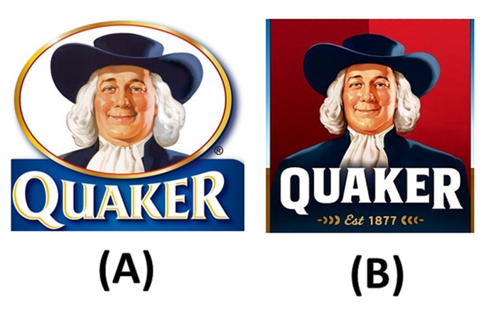
This feels a lot like one of those games on a kids' menu at a cheap restaurant that asks you to name the differences between two seemingly identical pictures. But once you've tried to figure out the differences, answer one more question: which logo makes you feel more like buying oatmeal--Larry (A) or Larry (B)? Indifferent? Me too...
What you're looking at on the right is what's known in the marketing industry as a "brand re-invigoration." PepsiCo, which owns the Quaker brand, decided to give Larry a new look, hoping to keep the brand "fresh" and "innovative." Yet somehow, when I stare at the face of new Larry, those aren't the words that spring to mind...three others seem more appropriate: "waste," "of," and "time."
I've spent enough time around marketers and witnessed enough "brand reinvigorations" firsthand to muster an educated prediction: this will cost PepsiCo a lot of money and have virtually no impact on sales. Marketers spend so much time with their focus groups and consumers insights teams, exploring the depths of the consumer psyche, that they lose touch with reality.
Here's the answer to that question: "what's different about Larry (B)?" Quaker's brand consultant, a company called Hornall Anderson, claims that the changes were critical to convey Quaker oatmeal's key messages of energy and healthy choices. The consultants scaled back on Larry's double chin and removed just a hint of portliness from his cheeks. Apparently Larry also received a haircut, though I've stared at the logo for about five minutes and can't see any difference in the hair, other than some darker shadows on new Larry's 'do. I feel like it's one of those 3-D Magic Eye pictures that I've always struggled with...

Tree? Horseshoe? Semi-truck? ????
You may also notice that Larry's shoulders now appear in the logo, and that's no accident. According to Hornall Anderson, including his shoulders in the logo makes Larry appear "stronger and more vibrant." I have no way of proving this, but I think that might be the first time that the word "vibrant" has every appeared in the same sentence as the word "Quaker."
And, perhaps most obviously, the logo now has a two-toned red background in place of the old, dull white. Again, behind this seemingly minor change is a load of marketing crap. The multi-toned color allegedly adds "a sense of movement." Normally, I'd insert another sarcastic comment here, but I'm not even sure what that means...
Maybe it's the finance person in me, but I would have left Larry alone--at 134 years old, I'd say he's looking pretty darn good. Too bad the rest of us don't hold up to the test of time so well--if Larry were an actual person, Quaker would have a decaying pile of flesh for a logo...but obviously, that's not vibrant and says nothing of energy or healthy choices. Regardless, I really don't see Larry (B) selling any more oatmeal than Larry (A) sold for all those decades.
The consultants may sound like snake oil salesmen as they explain the meaning behind each trivial change, but they know how to rake in the money. When asked, Hornall Anderson wouldn't say how much they were paid for the overhaul, but I know from experience that "brand reinvigorations" don't come cheap. Most impressive is a quote from the VP of design for Hornall Anderson when explaining the subtleties of Larry makevoer: "the goal is not to have anyone notice he is different." I'm having trouble trying to think of another job where you can earn a mountain of cash by coming up with changes that you hope no one notices! I'm going to convince my manager that I'm not unproductive; I'm just very effective at subtly accomplishing things...
I'd consider hanging up the spreadsheets and making the move to marketing, but I think my approach is all wrong. If someone asked me to freshen up or reinvigorate Larry, subtlety would be the last thing on my mind:

Now that would get people's attention on the shelves. But I don't want a Larry that appeals only to the female population, so I'd take it one step further and create an alternative package option:

Now men will want to eat more oatmeal, too! But Larry's head on a female body, while popular in the LGBT community, might ruffle a few feathers back at Quaker headquarters. A transgender Larry may not be consistent with the brand's conservative, foundational pillars. So until I master the art of subtlety and unconvincing marketing-speak, I guess I'll continue crunching away at those numbers.
Here's Wall Street Journal's coverage of Larry's makeover:
http://online.wsj.com/article/SB10001424052702303404704577309540451674640.html
No comments:
Post a Comment